Introduction to Colour Theory
We are surrounded by colour and it comes as no surprise that colour theory encompasses a multitude of definitions and applications.
However there are some basic fundamentals of colour theory that will be most helpful in assisting with your design applications.
Colour Models
A colour model is a way to describe colours in a colour system.
The following describes the 2 basic colour models; Additive (light) and Pigment (ink/paint).
Additive Theory (or light theory)
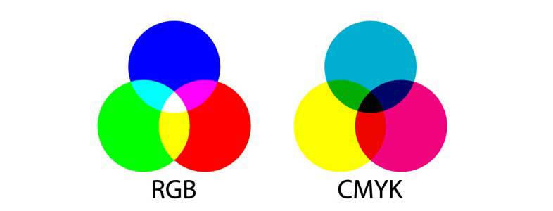
The primary colours in Additive Theory are: Red, Green, Blue
Commonly written R,G,B
When the RGB primaries of light are mixed they produce white light.
Video is the process of capturing and radiating light, therefore it uses Additive (Light) Theory not Subtractive (Pigment) Theory.
Light Theory is also used in Television, theatre lighting, web design, computer monitors and screens.
Subtractive or Pigment Theory
Colour in pigment is subtractive
Primaries are red, yellow, blue.
When the primaries of pigment (paint, dye, or ink) are mixed they produce black or dark brown.
The primaries commonly used for printing are clear yellow, magenta (red), and cyan (blue). Or commonly written CMYK.
Coloured Pigments absorb light and reflect only the frequency of the pigment colour.
All colours other than the pigment colours are absorbed and this explains why it is called subtractive colour theory.
Subtractive or Pigment Theory is used in printing and painting.
When the primaries of pigment (paint, dye, or ink) are mixed they produce black or dark brown.

Colour Science
To fully understand colour, it is important to touch on the science of light, just a little.
Have you ever wondered how an object gets its colour?
The light you can see is just a small part of something bigger called the electromagnetic spectrum which fascinatingly enough includes X-rays, gamma rays, microwaves, radio waves, and ultraviolet radiation and you guessed it… visible light rays.
All parts of the electromagnetic spectrum can be thought of as sets of waves moving through space, The distance between two waves that follow each other is called a wavelength. Wavelengths can vary from the size of a football field for a radio wave, to the size of a bug, for microwaves, and visible light waves are smaller than the size of bacteria. Variation in wavelength corresponds to different colours.
It was Sir Isaac Newton that discovered that light is the source of colour. When a beam of light is diffused, a spectrum of the entire range of pure colours if formed. In the spectrum, the colours are arranged in order of wavelength. The longest wavelength is red, the shortest is violet. Of the electromagnetic spectrum, our human eye is only able to see the visible light.
How We See Colour
White light contains all colours of the spectrum. As light hits an object the colours are either absorbed or reflected. Objects appear different colours because they absorb some colours (wavelengths) and reflected or transmit other colours. The colours we see are the wavelengths that are reflected or transmitted
We see white when all the wavelengths are absorbed.
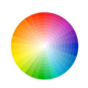
If the ends of the spectrum are bent around a colour wheel is formed:
The Colour Wheel
The Color Wheel shows the relationships between the colours.
Fun Fact: White light is made up of lots of different colours and if you spin a colour wheel, the eye combines the spinning colours and sees the disc as if it were white.
Colours on the wheel can be described using three parameters:
1. Hue: degrees from 0 ̊ to 360 ̊
Hue is the term for the pure spectrum colours commonly referred to by the “colour names” – red, orange, yellow, blue, green violet – which appear in the hue circle or rainbow. Theoretically all hues can be mixed from three basic hues, known as primaries.
2. Saturation: brightness or dullness
Saturation describes the intensity of a colour. A highly saturated colour is bright and appears closer to the edge of the wheel. A more unsaturated colour is dull.
A colour with no saturation is achromatic or in the grey scale.
3. Value: lightness or darkness
Value refers to how light or dark a colour appears. To make a colour lighter in value, white is added. A light colour is called a tint of the original hue. For example, pink is a tint of red. To make a colour darker in value, black is added. A dark colour is called a shade of the original hue. Maroon is a shade of red.
Primary Colours
The primary colours are red, yellow, and blue. These colours cannot be created by mixing the other colours.
They can only be created through the use of natural pigments.
All other colours seen on the colour wheel can be created by mixing primary colours together.
Secondary Colours
Primary colours are mixed in order to get secondary colours. The secondary colours are orange, green, and purple.
By mixing red with yellow we get orange, and by mixing red with blue you get a violet colour. Blue together with yellow turns into green.**reword slightly to my voice.
Tertiary Colours
Tertiary colours are achieved by mixing the primary colour with the neighbouring secondary colour.
There are six tertiary colours; two colours from each primary colour.
The correct way to refer to tertiary colours is by listing the primary colour first and the secondary colour, second. Tertiary colours are named: red-purple, red-orange, blue-green, yellow-green, blue-purple, and yellow-orange.

Colour Temperature
Most hues fall into one of two temperatures:
Warm: red, pink, orange and yellow
Cool: blue, indigo, purple and green
Colour Harmony in colour schemes
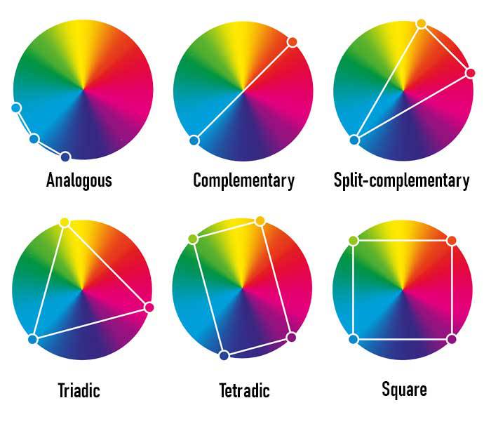
The relationship hues have with one another on the colour wheel can be used to find interesting pairs or combinations. Also known as colour schemes, the following lists 6 most popular types:
1. Monochromatic (meaning “one colour”) – a single colour broken out into different values
2. Analogous – uses colours that neighbour each other on the colour wheel. An example is a colour scheme that includes various values and intensities of reds and oranges.
3. Complementary– two hues that sit directly opposite on the wheel
4. Split-complementary – a trio where one sits opposite two hues that neighbour its complement.
5. Triadic – three colours that are equidistant from one another on the colour wheel
6. Tetradic (double split complement – two pairs of complements, one apart on the colour wheel. An example is red, green, orange, and blue.
7. Square – a combination of four colours equally spaced around the colour wheel.

